At a Glance
The first screen in your workspace: recent performance, how pages spread across the bands, and your AI search share.
App route: /workspaces/{slug}
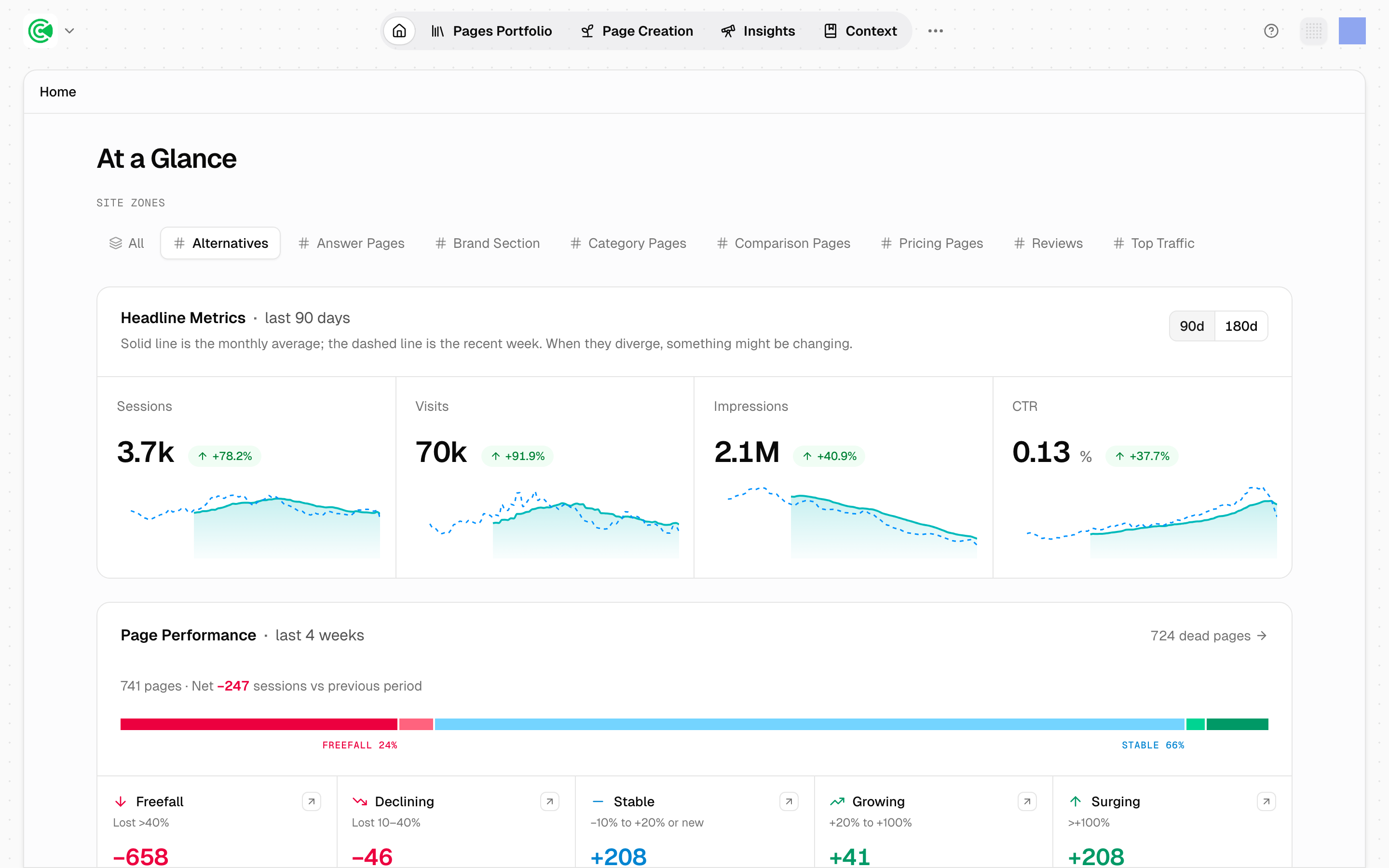
At a Glance is the first screen in your workspace, behind the Home tab. A workspace holds everything GrowthOS knows and does for one brand, and every figure on this screen covers that brand only.
It answers three questions:
- how your websites performed over the most recent period,
- how your pages are spread across performance bands, and
- how much of your traffic now arrives from AI answer engines like ChatGPT, Perplexity and Google's AI Overviews.
It groups your pages by what's happening to them rather than averaging them into one number. A site-wide average can hold steady while 50 pages quietly start losing traffic.
For the page-level numbers behind a change, open the Pages Portfolio. It lists every URL on your site, scored individually.
Doing this rather than looking it up? The Tutorial walks this screen step by step in 1.3 · Find your way around.
Reference
The performance bands
Every page that has traffic falls into one of 5 bands, measured against the previous period of the same length.
| Band | What it means |
|---|---|
| Freefall | Traffic falling sharply |
| Declining | Traffic slipping steadily |
| Stable | Traffic holding roughly level |
| Growing | Traffic rising steadily |
| Surging | Traffic climbing sharply |
Every band describes a direction, not a level. Freefall means the page earned traffic and is losing it, not that it never had any. A high-traffic page can sit in Declining while a small one sits in Surging.
Pages with no traffic
Pages with no traffic at all are counted separately, outside the five bands.
A Freefall page needs a diagnosis; a no-traffic page needs a decision. One had something and is losing it. The other never landed, which is usually a question about whether it should exist at all.
The AI Search split
Shows how many visits arrive from an answer engine rather than from a search result, broken down by engine. That tells you whether your visibility is broad or concentrated in one.
It's shown separately from organic search on purpose. AI volume is small next to unpaid search listings, and folding the two together would hide a number that's small but growing.
Where each number comes from
Every block on the screen names its own data source.
| Block | Source | What that means |
|---|---|---|
| Traffic figures | Google Analytics | Sessions and users: visits, and the people making them |
| Impressions and position | Google Search Console | How often your pages appeared in search results, and where they ranked |
| Page counts | The crawl | The pages GrowthOS found by reading your sitemap, the file listing every page on your site |
When two blocks disagree, the source line is usually the explanation. They come from different systems counting different things.
Page counts still appear when no analytics are connected, because they come from the crawl rather than from Google. If the traffic blocks are empty, check your connectors on Websites. Those are the links to Google Analytics and Search Console. GrowthX sets those up, so if one reports a problem, raise it with your strategist rather than trying to fix it there.
Reading the chart
The solid line is the monthly average. The dashed line is the most recent week.
Where the dashed line pulls away from the solid one, something changed too recently for the average to absorb it. That divergence is why both are drawn.
If the numbers look wrong
A period that hasn't finished yet can look like a decline. A figure measured against the period before it holds fewer days of traffic than the one it's compared against. 28-day trends are the exception: each window ends no later than the last day its source has synced data, and the current and previous windows are always the same length.
Read on the 21st, a month-to-date figure is 21 days of traffic sitting next to a full previous month of 30. The gap is the 9 missing days, not a drop in performance. Check which period you're looking at before treating any fall as real.
Related
Every URL on your site, scored individually. This is where the page-level numbers behind a change live.
Why distribution is the honest read of a site, and what averages hide.
The analytics connectors every traffic figure on this screen depends on.
The guided tour of the five areas, including this one.